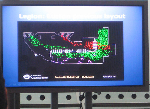
The image above shows passenger flow before improving the congestion, simulated using Legion. The green dots are people entering, and red dots people exiting.

The flow improves considerably as can be seen once the ticket gates and hall layout were changed. The congestion is reduced as it provides more of a two lane flow of exiting and entering pedestrians. More details about the public discussion can be found on Going Underground's Blog
No comments:
Post a Comment